What if our eyes were capable of perceiving even subtle differences in brightness? How different would our view of the world be as a result? Is there a way to visualize this? Yes, I think there is. I will now try to describe how this can be achieved.
So let’s look at how the human eye perceives a black-and-white photograph.
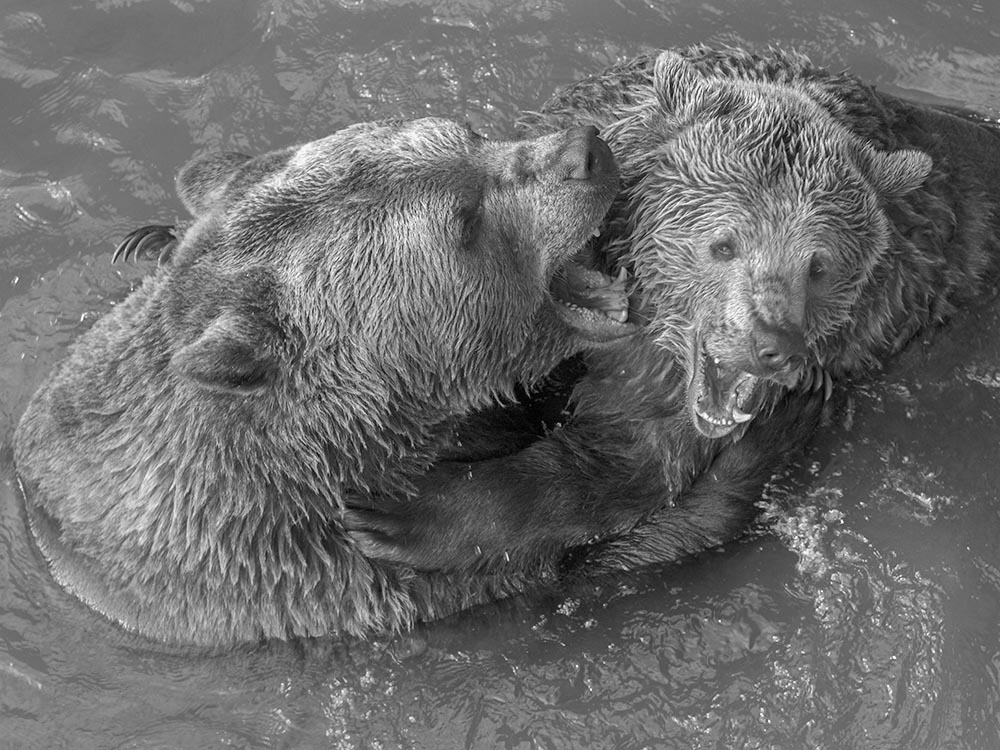
We can say that we perceive the darkest areas as black and the lightest areas as white. Everything in between consists of various shades of gray. This spectrum can be represented as follows:

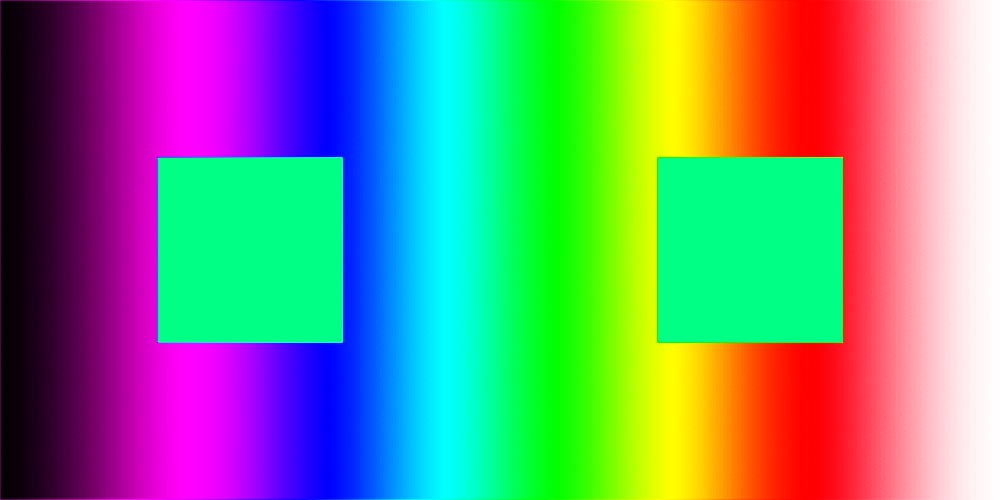
Since our eyes aren’t very good at perceiving small differences between two shades of gray, I decided to add the entire color spectrum as intermediate steps to this gradient. The resulting gradient then looks like this:

Black areas remain black, white areas remain white, but the gray gradient between them is now enriched with colors. Below is an example of what a photo of a bear would look like after applying this new gradient.
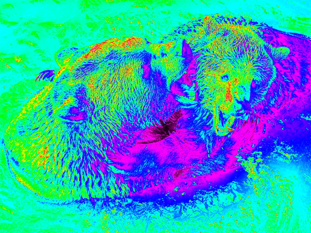
The photo reveals details that would be lost in a normal black-and-white photo. I also experimented with this gradient on analog photos (see below). For comparison, the original black-and-white photo is always shown first.
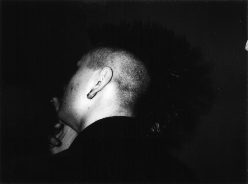
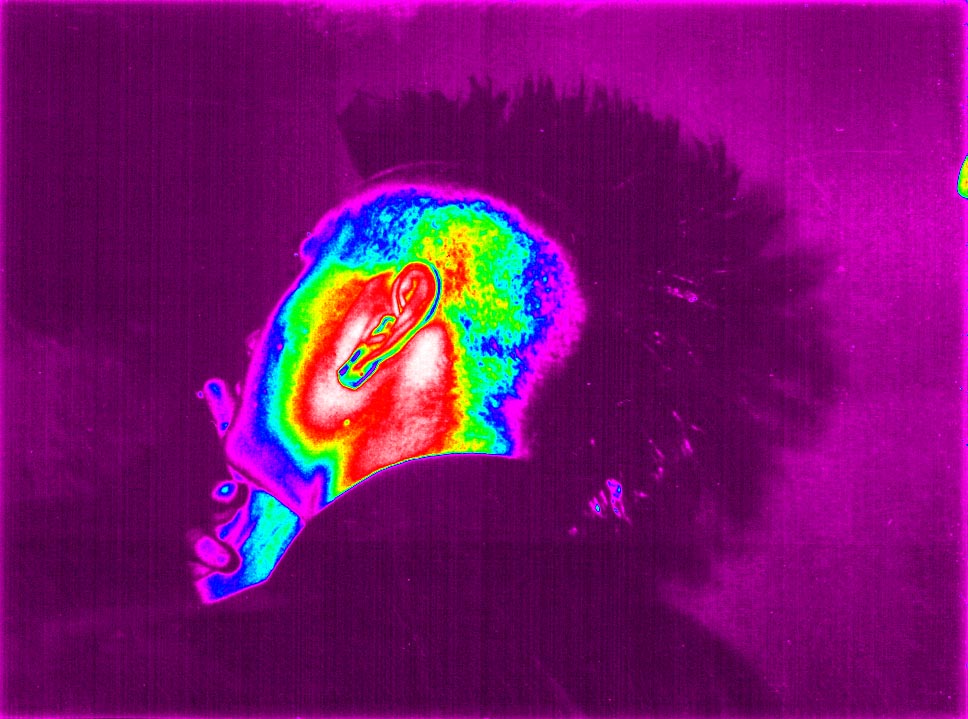
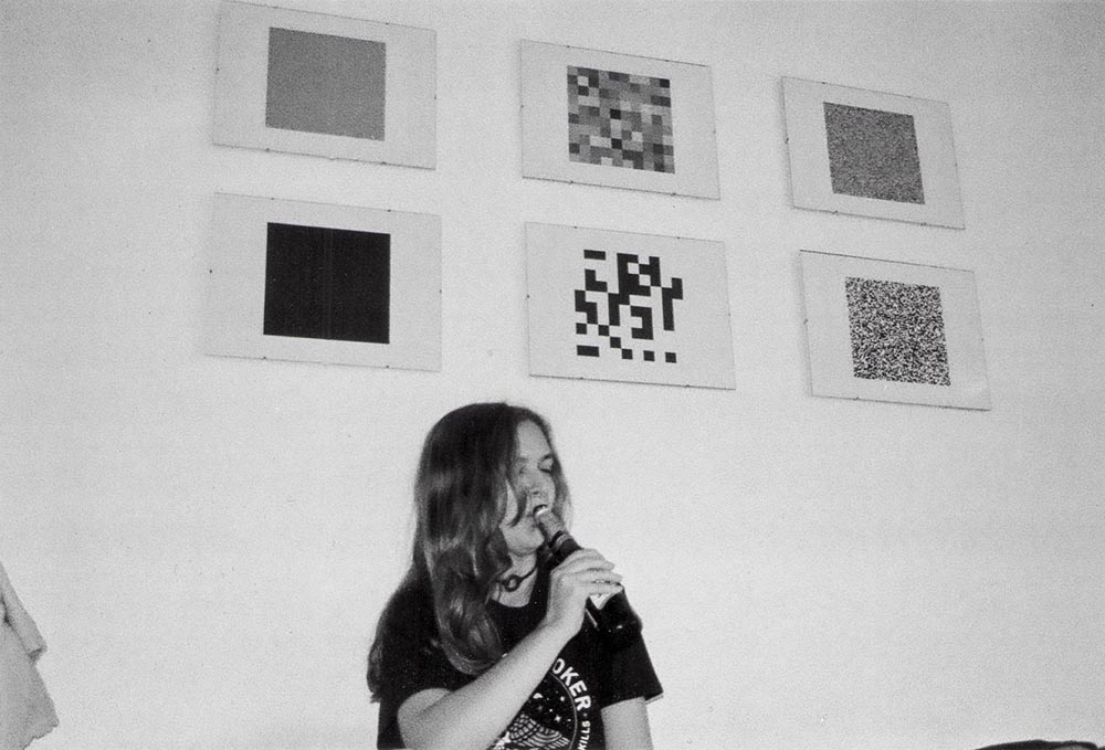
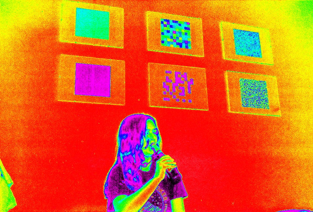
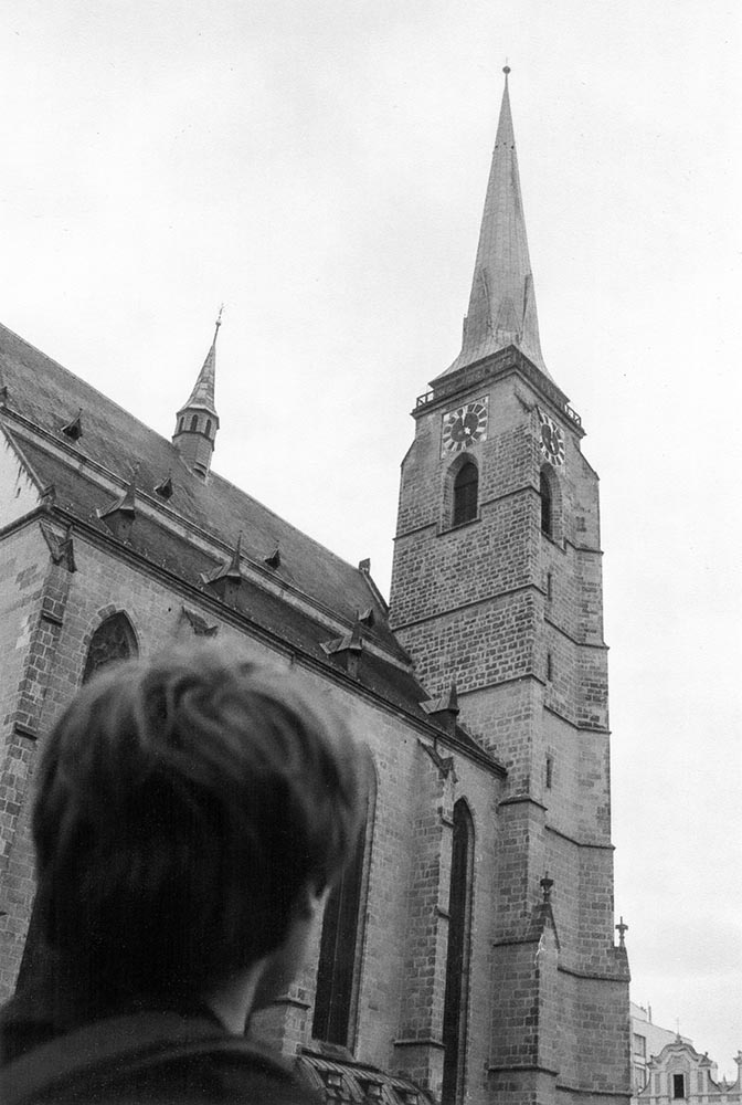
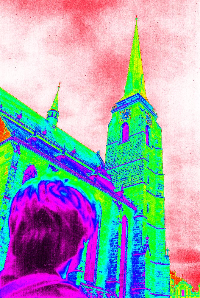
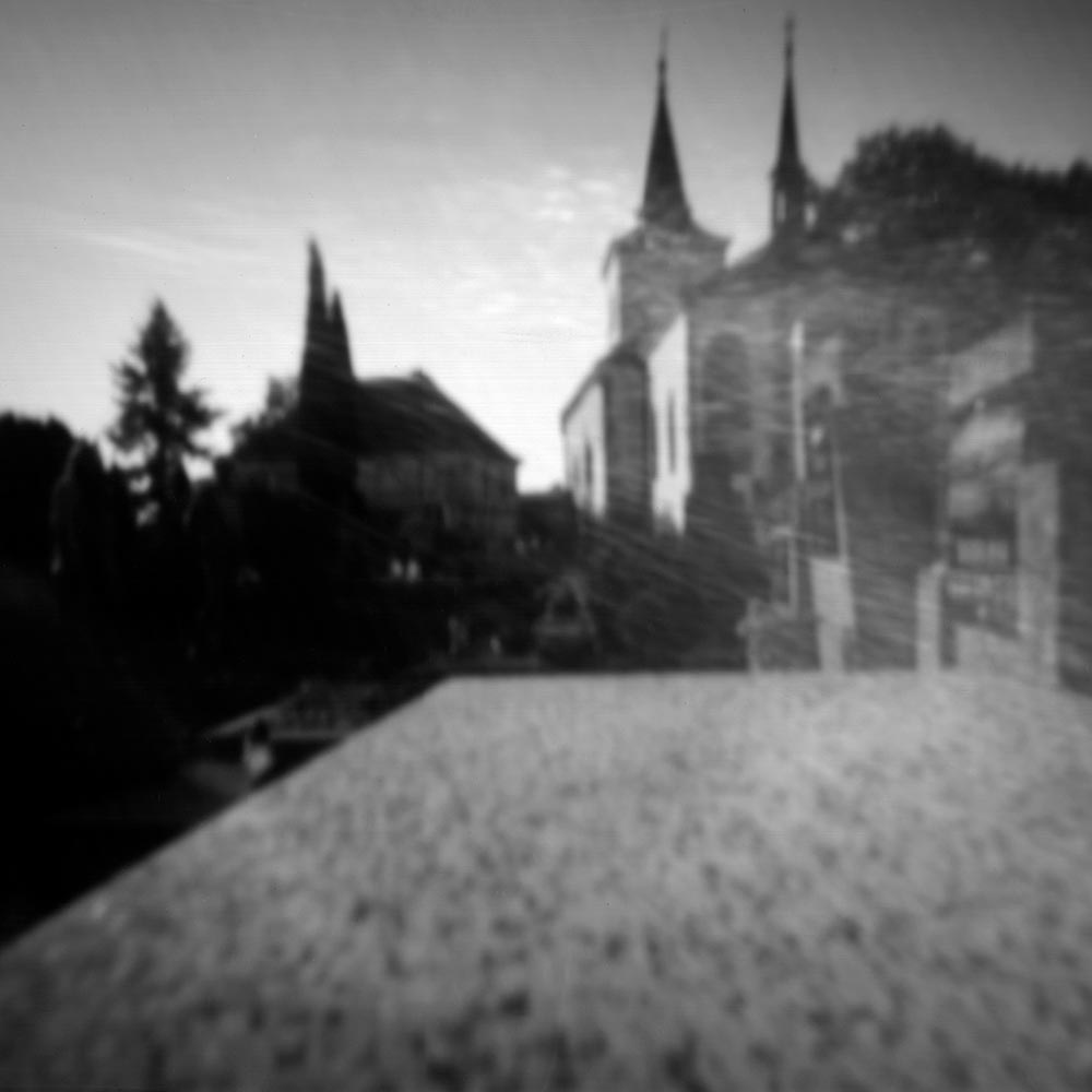
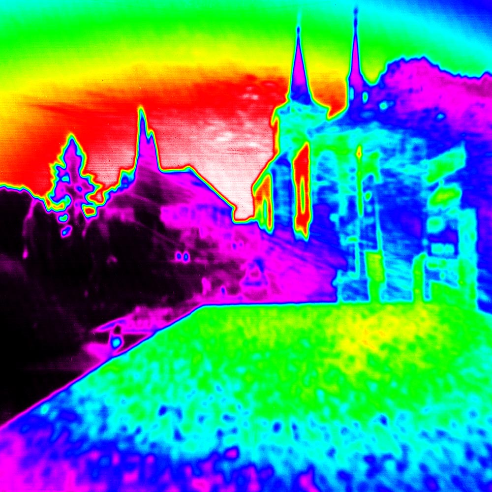
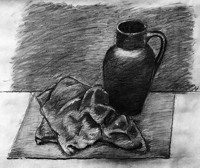
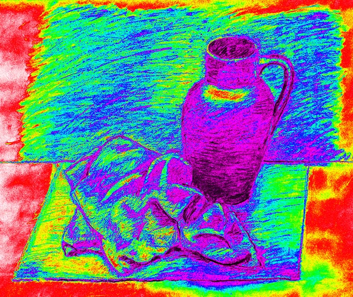
I was curious to see if this gradient could be used in drawing to achieve more precise shading. That’s why I tested it on one of my older drawings:
I decided to further test this gradient on optical illusions based on our imperfect perception of differences in brightness. Here’s one example of such an illusion:

Just as you’d expect, both squares are identical. Yet to the human eye, one appears lighter. If I apply this gradient to the illusion above, it will become much clearer that the squares are the same shade. The illusion is thus disrupted and ceases to be an illusion.
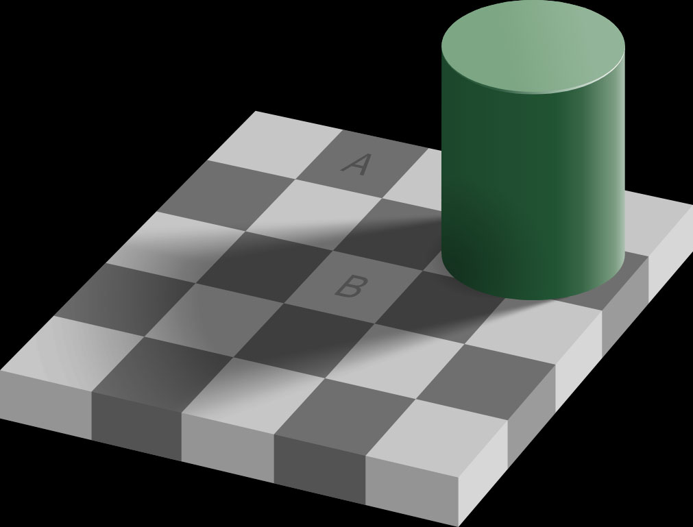
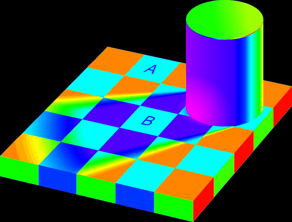
Another similar illusion is the Checker Shadow Illusion. The principle is the same: areas A and B are the same shade, even though they don’t appear to be. When we apply the gradient to it, this becomes obvious.